
There is no perfect recipe for getting our business card noticed and remembered, but perception psychologists have identified a few simple rules that increase the likelihood of seeing the message we send. They have been used by advertising creators for years. Nothing stops you from using them when designing business cards.
The rule of balance
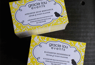
When talking about balance, the vision of two weights lying (or perhaps hanging) at the same level comes to mind. According to this reasoning, the most important information in the image should be placed exactly in its center. However, our perception works a little differently. As research has shown, the so-called optical point is located one third of the distance from the upper end. This is where our eyes stay the longest. Observing a classically constructed business card, we see that this is where the name and surname of its holder appears. Knowing this, it is better to think twice before trying to change this position through innovation. Sometimes it’s better not to improve something that works.

The glance rule
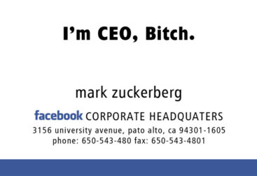
Knowing this rule turns out to be useful when we know that the recipient of our text (in this case, a business card) will have to analyze a large amount of information. If during a job fair our future employer/client/co-worker has to look through a large number of business cards, what should we do to make sure that ours catches his eye? This time the principle „less is more” should work very well. We can achieve greater focus by leaving a large free space around the main message. When browsing quickly, it is easier to spot information that stands out in this way than by wading through a thicket of small letters and graphics.
Traffic rule
Evolution has adapted us to see moving objects more easily. This made it easier for our ancestors to see a predator charging at them or catch a escaping prey (when it turned out that we were high in the food chain). Because of these biological influences, things that are in motion attract our attention more easily. In static press or poster advertisements, where there is no real movement, this rule works thanks to the use of graphic indicators, such as an outstretched hand or an arrow, which „tell” the eye to move in a selected direction. On a relatively small business card, the traffic rule is not that important. However, it is worth considering whether a dynamic indicator is needed on our business card when we want it to stand out.
Author
Grzegorz Stachura