
A business card is the most frequently used and one of the basic communication tools, not only in business. It is important that our business card is legible and easy to remember. Below we present the 5 most common mistakes when designing a business card:
- Missing important data on the business card
When designing a business card, remember to include the most important contact details: name and surname, telephone number, e-mail address. These three basic pieces of information are the minimum that should be included on a business card. If our business tickets are used for business purposes, we must also include the company name and information about our position. Optionally, we can also include a fax number, office address or correspondence address and the address of the company website. Before sending the project for printing, let’s check whether we have included all the information that may make it easier for the client to contact us.
- Too much information on the business card
Sometimes we want to provide as much information about our company as possible with a business card. However, placing an offer or an advertising slogan on a business card makes the contact information illegible and makes our business card much less elegant. However, if we really want to include such information, put this information on the reverse. Separate them clearly: on the first page – contact information, on the second page – commercial information. You can easily design a double-sided business card with our free editor.
- Errors and typos
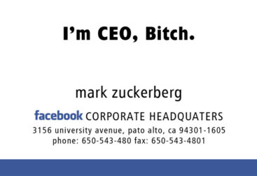
All types of errors such as: outdated data, incomplete data, incomprehensible abbreviations or typos make our business card less professional and may sometimes make it impossible to contact us. Before sending the project, let’s check the correctness of our data several times. Most often, typographical errors occur in e-mail addresses or website addresses.
- Too many colors
The best designs are simple designs. The chic and elegance of business tickets is often achieved by using a maximum of three colors. A business card that is too colorful may be perceived unprofessionally or not seriously. Let’s remember to choose the colors in which our business card will be designed carefully. It is important that the colors do not disturb the readability of the text. Only a few can afford the color madness, most often from businesses associated with a lot of colors, for example from the children’s industry (play animators, birthday party artists, etc.)
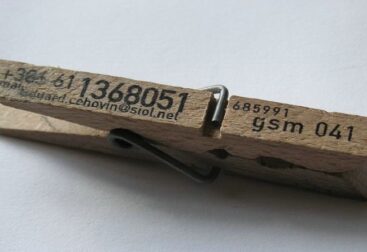
- Blurred logo, QR code or image
When placing your company logo on a business card or any other image, remember that it must be of appropriate quality (printing resolution). When placing the increasingly popular QR codes, you should also take care of their quality. It is best to print it in advance in the same size as the business card and check if it works. It happens that too much information contained in a QR code makes it unreadable.
To sum up, for our design to be elegant and professional, it must contain the most important data, have clearly selected colors and must not contain errors.