Extreme emotions on the border of the visible spectrum. You cannot remain indifferent to this article!
Designer’s dilemmas
Creating a business card is more than just putting your details on a piece of paper. When choosing a specific pattern, you also choose a set of colors that match the graphic identification of your company. By devoting some attention to this issue, you can significantly increase recognition by arousing appropriate associations – appropriate to the product or services you offer.
According to perception psychologists, each color cannot be assigned only one value, much depends on the personal experience of the observer. Nevertheless, you can collect a certain group of features that are associated with a specific color. On our blog we will post articles about the most popular colors used in business. We start with red.
What color is hunger?
In color psychology, red is associated with passion, energy, motivation to act, strength and excitement. The extreme color on the visible spectrum has a stimulating effect on the senses and is associated with hunger and desire. Often used to symbolically show love, it emphasizes its physical aspect. Its softened version – pink, is more often associated with platonic love.
In terms of gender preferences, red is associated with masculine energy, while pink is associated with feminine energy.
It is also the color of warning signs, often used for constructive criticism, and is used to highlight mistakes.
A bloody practice
Due to the stimulating effect of this color, it is often chosen for advertising food products because it stimulates appetite. Red both arouses excitement, but also causes fatigue if the observer looks at it for too long.
When you use red in business, it is good to remember its positive aspects, but also the risks associated with its use. As is usually the case with extreme cases, it may arouse such emotions. It is a color that motivates action, but it can be both negative and positive. This reaction will depend on your client.
Red can be used as a sign color directing potential customers to your store, or as part of a website, implying readiness for action, or as an element of your business card inviting them to contact you again. Just like with fire, you should be careful with red and be careful not to overdo it.
Below we can see examples of companies that skillfully use red colors in their brands.

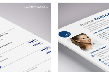
Here is an example of two business cards. In which case do you think the designer better tamed the hot temper of red?


